
This project works with archaic browsers, like FireFox 3 or (shudder) Internet Explorer 6. It does not seem to work well with current browser versions, and it is being left partly as a historical detail, with a clear reference implementation of how one would do this with today's browser.
The basic enhancement of allowing this for e.g. Gnome Terminal appears to be in the Gnome Terminal bug tracker, and so this functionality may be available someday in standard terminal programs by setting one's font to Verdana.
Design, typography, and terminals:
Not-so-good, better, best
Those of us involved in web design and usability know that fonts are not created equal. The first incarnation of my own website used fixed-width fonts for almost everything, because I didn't know what I was doing. Since then, I've joined the rest of the web in recognizing the benefits of using a font optimized for on-screen reading.
In the spirit of the sort of makeover done by Tufte in books like Envisioning Information, I would like to look at three different terms; the last one is the one offered here.
Not-so-good
This is a (cropped) screenshot of the default term (xterm) that shipped with my EeePC. It has a black background, like ancient VT100's:
 What this is optimized for is densely packing information into a tight space, and for serious coding this is seriously answering the wrong question.
Better
Let's look at a terminal that shows much better typography and design:
 This has a more readable font, and it makes productive use of space: more specifically, it uses space to enhance usability and readability, not cram in as many bits per pixel as can still technically be read. The font, unlike even the Mac Terminal, is deftly anti-aliased, and to a designer the font appears to have been clearly designed for usability.
Best
But we can do better by breaking out of the grid and using web-based typography as a starting point, and tweak the spacing for reading code:
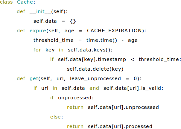
I've looked at a lot of code this way, and the difference is remarkable. If your code is formatted well, it is easier to read and you can tell more at a glance and then zero in on what you need. It has just a little of the magic of of moving from find/grep/xargs to ack, ordiscovering Python. Having tried it, I really don't want to go back.
How did I do that? By standing on Antoine Lesuisse's shoulders with Ajaxterm (download). A few CSS tweaks, and there is a terminal that takes advantage of the web's advances in typography and usability.
Download
| Version | Download tar.gz | Download tar.bz2 |
|---|---|---|
| 0.11, stable | enhanced-terminal-0.11.tar.gz | enhanced-terminal-0.11.tar.bz2 |
| 0.10, development | enhanced-terminal-0.10.tar.gz | enhanced-terminal-0.10.tar.bz2 |
License: All changes from Ajaxterm 0.10 are free software in the hopes that they may be useful but with ABSOLUTELY NO WARRANTY, WITHOUT EVEN THE IMPLIED WARRANTY OF MERCHANTIBILITY AND FITNESS FOR A PARTICULAR PURPOSE, available under your choice of the Artistic, GPL, and MIT licenses. If you like this software, you are invited to consider linking to CJSHayward.com. Ajaxterm itself is not my work, but is in the public domain, except for its included Sarissa materials, which are LGPL.
(These instructions are for Unix/Linux/Mac; on Windows, I would try Cygwin.)
Troubleshooting tip
- If you have trouble logging in, and this makes sense in your security situation (by default, Ajaxterm listens on localhost, and firewalls can block 8022 from access by other machines ensuring Ajaxterm is only available locally), you can pass ./ajaxterm.py the argument "--command=bash" and possibly have connections to http://localhost:8022/ simply served bash as the user running ./ajaxterm.py.